
In this last installment of the three part series on creating hover menus, I’m going to show you how I created this vertical menu with elements that slide down. If you’ve read Part 1 and Part 2 of this series, then you know how easy these menus are to create and customize. If you’re very new to using HTML and CSS, I would suggest reading
Part-1 first, since it does have a more in-depth approach to using the languages to create these projects. However, if you’re already somewhat familiar, this project should be no problem for you to understand.
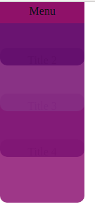
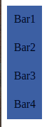
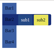
Another vertical hover menu
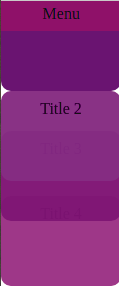
For this menu, I wanted to create elements that stacked on top of each other and would slide down when hovered on to reveal a title or more information as required. I also played around with the opacity to create an interesting effects (more on that later) . The menu closes once the “menu” button is clicked, so it doesn’t infringe upon the the content of the rest of the site, since this menu can take up quite some space.
I imagined this would be used in applications other than just navigation bars. There is an opportunity for discoverability here and the smooth transitions offer a unique experience. I hope you get creative and create something special for your own purposes!
So here are the steps I took to code this:
Part 1: The HTML
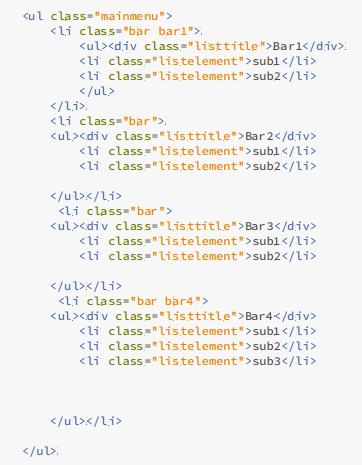
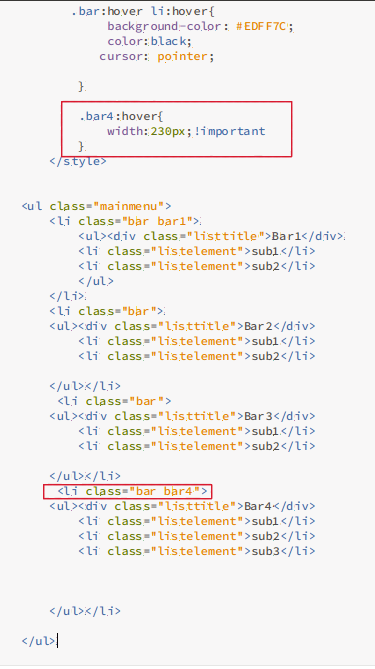
In the previous two examples, I used li items as the list elements. However, here I decided to create a few divs instead.
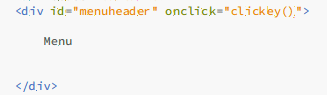
I simply created a div with container class and added the divs inside them in the order that they would appear, and assigned id’s to each of them. First was the menuheader, which could be clicked to display/hide the entire menu. After that came the menu elements which I decided to call cards, and I numbered each of them individually (eg. id=”card2″).
You can see that here:
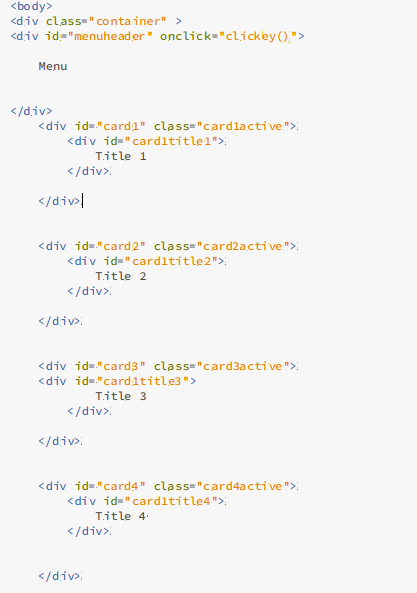
After this, I added links to my CSS stylesheet as well as the javascript file.
Don’t worry about the classes for each of the cards just yet, I’ll show you why I put them in, a little later.
Part 2: The CSS
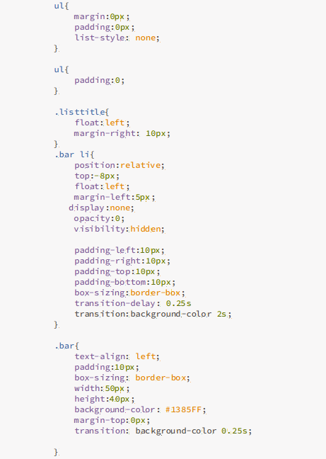
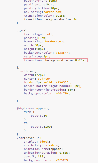
The very first thing I wrote in the CSS file was a CSS reset. This was to remove the default margins, paddings and other browser presets, so that I wouldn’t get unexpected results and the code was a little easier to adjust.
Now comes the interesting bit.
I styled the menuheader how I wanted it and then set its position to absolute. This way I could push it to the very top left edge of the container div.
Since I wanted the menu to be hidden unless the menu button was clicked, I wrote a class called inactive and set display to none ( I assign this class later using javascript)
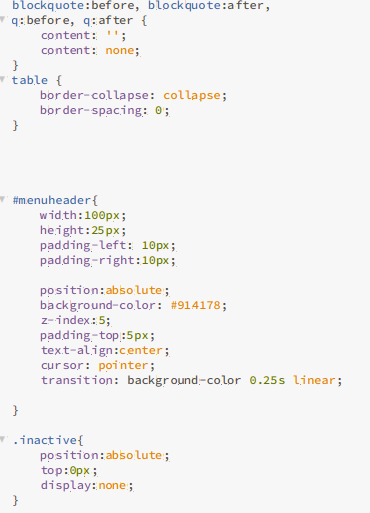
Notice that the z-index of menuheader is 5. This is because the menuheader div was the first div in the container class and would be sent to the bottom when I positioned all my other divs. To solve this I set z-index to zero. Z-index is relative, and the element with the highest z-index is sent to the top.
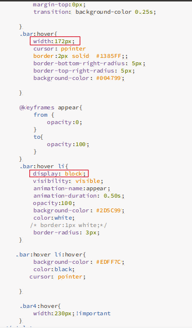
Now, the next part was to decide where all the cards would go once I clicked on the menu button. For this, I created separate active states for all of the cards , since their position would differ.
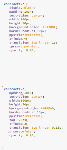
Notice how the position is relative? This allows me to send the card elements where I want them respect to their initial position. The first card is right at the top of the container div. Now, the second div would appear right below it but I wanted it to have the appearance of being tucked away slightly behind the first card element. So I set top to -25px, which moved card2 to 25px above its initial position.
Now for card3 and card4, you’ll have to take into account that you already shifted the previous card, so you’ll have to make up for that by adding it to the 25px displacement you want. So that would be -(25+25=50)px for card 3 and -(25+25+25=75)px for card4. You can keep doing this for any number of cards that you have.
Note that you can always do this dynamically using javascript if your list is really long.
Also I changed the z-index so that the first card was above the second, the second was above the third and so on.
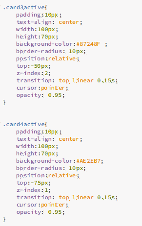
I also changed the opacity to 95% so you could see the elements below it, and added a transition to create that sliding effect
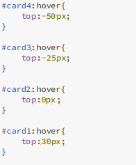
For the last bit, I had to make sure the card slid down out from behind the card above it when hovered on. This was easy. I just removed -25px ( the measure of the card that’s in hiding) from the top property.
With the CSS complete, all that’s left to do is add some javascript to make the menu appear and disappear.
Part 3: The Javascript
Here the menu’s closed

When you click on it:
Click on the menu button again, and it closes
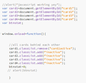
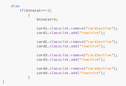
When the window loads, I want the menu to be hidden. Remember that inactive class I created? I’m going to add it now using javascript
Next I create a function called clickey() to toggle between the active and inactive states. Remember, clickey() triggers when the menuheader element is clicked.
From the html file:
If you’ve linked your javascript file correctly, the clickey() function should be called
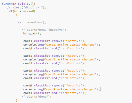
The btnstat variable measures whether the menu is currently open or closed.
And its complete!
Feel free to try out the project by viewing it online or downloading the code from github
I hope you enjoyed this example and will give it a whirl when you can. As always, you can comment your questions and feedback down below and I’ll try to answer as soon as possible.
 Stashable